In late 2019, PBS announced an update to its iconic brand, including a refreshed logo, bold color palette, custom typeface and illustration style. WEDU’s participation in this rebrand launch was delayed, as we also wanted to update our own decades-old logo. Along with the Brand Manager at WEDU, I was tasked with this logo refresh. The old logo was ‘squished’ and a thin weight, and became almost illegible at small sizes, which is key because of how important social media avatars and other small applications of the logo are. The ‘waves’ in the old logo were also deemed important, both as a way to pay homage to the old logo and as a representation of our West Central Florida’s beautiful Gulf Coast waters. The navy and royal blue colors were the main colors in the PBS national rebrand, and the new WEDU logo was required to be accompanied at all times by the circle icon and “PBS” in the new custom font, as shown. We went through months of rounds and different iterations with the President/CEO and finally settled on the one labeled “Final Logo” below. Below that are just a few of the ideas during our process.
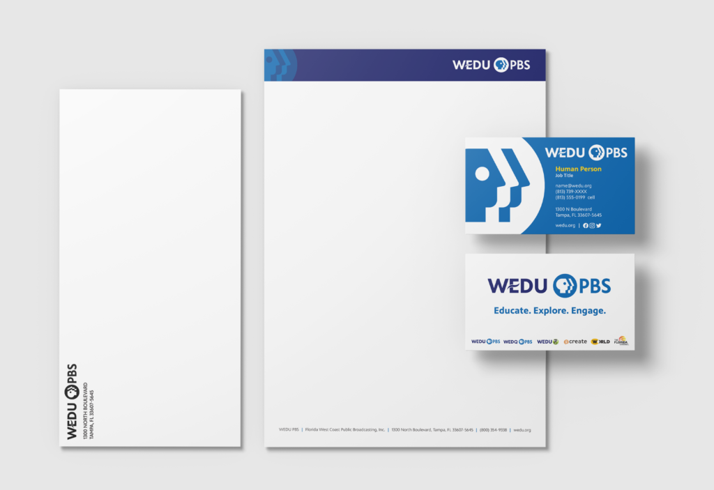
Obviously with new branding comes new collateral. Here are the business card, letterhead, and envelope:
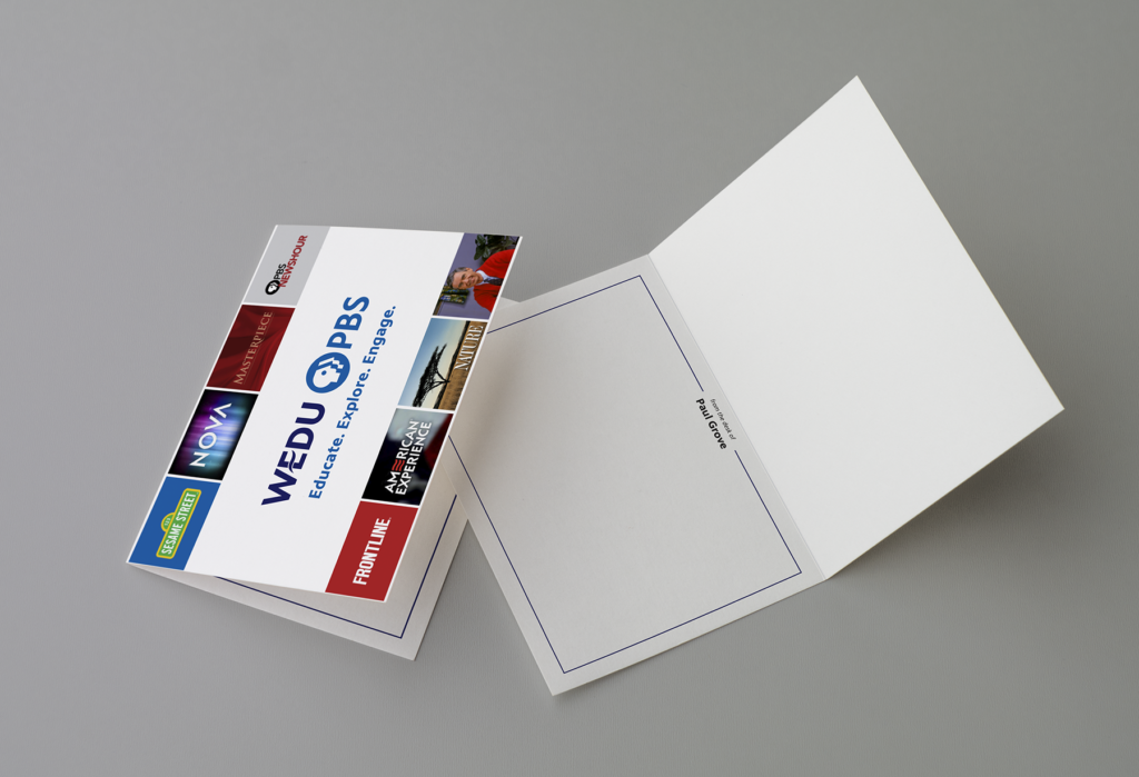
Our President/CEO sends invitation-size notecards for notes, thank you cards, and other correspondence: